Visual Hierarchy Flow
Every click starts with a glance. This article breaks down the invisible logic of visual hierarchy, and how to guide attention with purpose, not guesswork.

"Visual hierarchy is the arrangement and prioritization of elements in a design to guide the viewer’s eye in a deliberate sequence, from most important to least."
It answers:
What should users notice first?
- Where should they look next?
- What can be downplayed or skipped?
Key Tools Designers Use:
- Size – Bigger gets noticed first.
- Contrast – Light/dark, bold/muted, color pop.
- Position – Top-left or center tends to dominate.
- Spacing – Grouping vs isolation shapes flow.
- Typography – Bold, caps, weight, hierarchy.
- Imagery – Faces, movement, or icons grab fast.
A Recent Micro-Project Example
This layout comes from a simple real estate landing page I recently worked on — a micro-project, yes, but the stakes are still real. In fact, the smaller the scope, the more essential clear structure becomes. There’s often less time, less content, and less budget — which means less room for confusion.
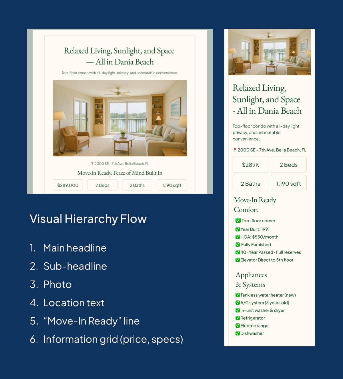
What Works Well
Headline Still Leads
The headline maintains brand consistency in style and tone — the eye naturally starts here.
Tighter Subheadline
It’s leaner and emphasizes privacy and convenience, which complements the emotional appeal above with practical value.
Hero Image with Context
The image now shows a different part of the condo, with more real-life and lifestyle context. This supports the selling point about sunlight and privacy.
Location Pin Under Image
Subtle, but efficient. It reinforces trust and place identity without overwhelming the hierarchy.
Secondary Headline (“Move-In Ready…”)
A powerful reassurance point that’s still scannable. It uses sentence casing for contrast with the uppercase buttons below.
Information Grid
Price, bedrooms, bathrooms, and size are chunked into digestible visual “tags.” These are highly scannable and fulfill the “need-to-know” queries fast.
Strong visual hierarchy makes content clear, scannable, and intentional.
Without it, users get confused or lost.