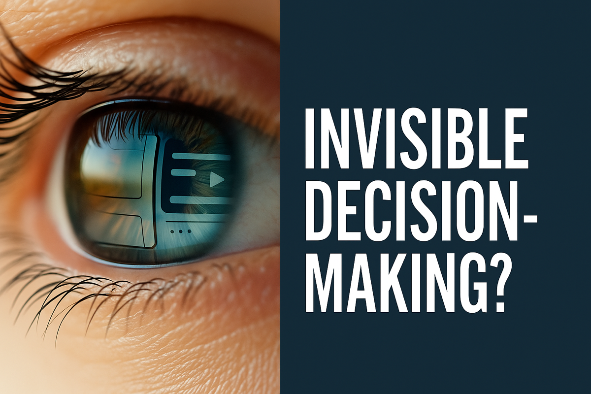
The Invisible Architecture of Design
Designers have always made invisible decisions—long before we had the words for them. This is a story about how those choices shape trust, flow, and outcomes, and why business leaders ignore them at their own cost.


Ah, 1988. Stone-washed jeans were in, rock ‘n’ roll was loud, everyhting felt infinite, tech and science were full of promise, and MTV was basically scripture for most of us. There I was, sweating over a drafting table, making what we now call “UX decisions” without a blessed clue what to call them.
We didn’t have the words back then.
There I’d be, passionately arguing over whether it should print the phone number or say “Submit” or “Send.” Points, pixels, inches, CMYK or RGB, DPI… it felt like we needed some kind of string theory just to bridge the gap between print and web. Was it for a magazine or the internet? How would it translate? I’d practically turn purple trying to explain why it mattered in this fast-growing world of visual communication, while the client stared at me like, what!?
These critical design decisions of structure, flow, labels, behavior, simply didn’t have names. Not to the client. Not to the team. And sometimes, embarrassingly, not even to us.
But UX was always there, quietly behind the scenes, embedded in every step since the moment graphic design was used to communicate, not just decorate. We just didn’t call it that. The learning curve for us was wild. So imagine what it was like for clients, we had no shared vocabulary, no clear process. Just gut instinct, print specs, and a whole lot of trust. And honestly? Paying for something they didn’t understand, something that felt invisible or “intuitive” must’ve felt like buying snake oil. Like we were selling BS.
And without the right words to explain the logic behind those decisions, we couldn’t really blame them.
Especially when the real work — the research, the thinking, the structure — takes way more time than the “design” itself. Why pay for that? We don’t need that. That part never made sense to clients. They’d see a clean screen or a simple layout and wonder, “Why did that take three weeks?” Lol.
So what are these invisible decisions?
They’re the judgment calls designers make that no one talks about — but that shape everything.
- What to leave in, and what to strip out.
- How to prioritize competing user needs or business goals.
- Which layout leads the eye, and which one causes friction.
- How labels, color, and hierarchy shape behavior.
- What micro-interactions reduce error or build confidence.
- How to reveal the right information at the right time — and hide everything else.
- Where trust is lost — and where it’s quietly built.
These decisions don’t show up in the final file name or the spec sheet. But they are baked into every step, from how the information is structured, to how a form behaves, to what happens when something goes wrong.
And most of them are made early in the messy middle, when the path isn’t clear yet, and nobody’s watching.
Designers knew in our bones these things mattered. We pushed for them with the fervor of religious converts. But without proper terminology, they remained invisible — spectral things, easily overwritten by whoever had the loudest voice or fanciest job title in the room.
Sure, we were taught some of this in design school — but roughly, sometimes. Things like semiotics, interface theory, user psychology. The terminology was still finding its footing. These weren’t yet standard ideas in the real-world meetings we sat in. Not in client rooms. Not in briefs. Not in budgets.
I cut my teeth in traditional graphic design. I literally used ink on paper and lived through the 15+ floppy disk installation days, when “kern” was still a dirty word to most people. Five megapixels was amazing. Anyway, now there’s AI and blah blah blah — they’re just tools. The point is: when I migrated to UX and UI, nobody sat me down with flash cards about “invisible decision-making” or “cognitive load.” I was already doing it — just the hard way, with a lot more coffee.
Now, with 20+ years and countless arguments behind me, I see these things more clearly. And thankfully, so do many clients. We’re all more conscious. More educated.
And the biggest shift? We can measure performance now. We can test, adjust, and make real-time tweaks before damage is done. We can back instincts with data. That alone makes the invisible visible — if you know what to look for.
But still, these invisible details aren’t just craft or fussy designer neuroses. They’re strategy. They’re money. They’re the difference between a brand that works and one that feels like a beautiful but ineffective, modified copycat.
“And the irony? The thinking, the analysis, the research, the testing — it all takes far more time than doing the damn design itself.
That’s what I want to talk about. What’s actually improved since we wore flannel unironically, and what stubbornly hasn’t. The stuff business leaders still overlook — and why it keeps costing them time, trust, and real results.
Because after all these years, here’s the truth: nothing burns money faster than rushed design decisions.